In a world where mobile devices are the go-to for online exploration, encountering a website that is unresponsive can be an exasperating experience. Lukard Technologies delves into the realm of mobile frustrations, unveiling the symptoms of an unresponsive website and shedding light on the adverse effects it can have on user satisfaction.
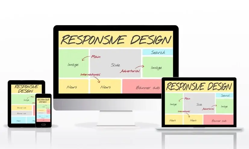
What Happens If a Website Is Not Responsive?
An unresponsive website can lead to a cascade of negative consequences, impacting both user experience and overall business objectives:
1. Poor User Experience:
A user attempts to navigate a non-responsive website on their smartphone, encountering distorted layouts and unclickable buttons.
Unresponsive websites hinder seamless interactions, causing frustration and dissatisfaction among users.
2. Increased Bounce Rates:
Visitors landing on a non-responsive site quickly abandon it due to difficulties in navigation.
High bounce rates signal that users are not willing to engage with a site that fails to cater to their mobile browsing needs.
3. SEO Implications:
Search engines may penalize non-responsive websites, affecting their rankings in mobile search results.
Google and other search engines prioritize mobile-friendly sites, making mobile responsiveness a crucial factor for SEO success.

4. Lost Revenue Opportunities:
An e-commerce site with a non-responsive checkout process leads to cart abandonment.
Non-responsive websites can directly impact revenue by deterring users from completing transactions.
How Do I Know If My Mobile Website Is Responsive?
1. Device Testing:
Use various mobile devices to access your website and ensure that it displays correctly on different screen sizes.
2. Google’s Mobile-Friendly Test:
Utilize Google’s Mobile-Friendly Test tool to evaluate how well your website performs on mobile devices and identify potential issues.
3. Analytics:
Analyze user data to identify patterns. High bounce rates from mobile users could indicate issues with mobile responsiveness.
4. Cross-Browser Compatibility:
Check your website across different browsers to ensure a consistent and responsive experience for users.
What Are the Issues That You Faced While Making a Website Responsive?
1. Complex Navigation Restructuring:
Transforming a multi-level desktop menu into a mobile-friendly, collapsible menu.
Adapting navigation structures for smaller screens can be challenging but is vital for a seamless user experience.
2. Image and Media Optimization:
Ensuring that images load efficiently without compromising quality on various devices.
Balancing image quality and load times is a common challenge in responsive design.

3. Consistency Across Devices:
Maintaining a consistent look and feel while accommodating different screen sizes.
Ensuring brand consistency without sacrificing functionality requires careful design considerations.
4. Touch-Friendly Interactions:
Enhancing button sizes and interactive elements for touch-based navigation.
Making websites responsive involves optimizing for touch, ensuring a user-friendly experience on mobile devices.
What Is a Non-Responsive Website?
Definition:
A non-responsive website is one that fails to adapt its layout and design to different screen sizes and devices. It typically leads to a poor user experience on mobile devices.
Characteristics:
Non-responsive websites may exhibit distorted layouts, unreadable text, and unclickable buttons when accessed on mobile devices.
Impact:
The impact of a non-responsive website extends beyond user frustration, affecting search engine rankings, bounce rates, and overall online visibility.

In conclusion, mobile frustrations arising from unresponsive websites can have far-reaching consequences on user satisfaction and business success. Lukard Technologies is dedicated to transforming these frustrations into seamless mobile experiences. By identifying and resolving the symptoms of poor mobile optimization, we guide your website towards responsiveness, ensuring that it caters to the diverse needs of users across various devices. Let’s elevate your mobile experience and turn frustrations into satisfaction.
Our Website Pricing Packages
-
Essential
-
$300.
-
Customized One-PageWebsite
-
Mobile Responsive Design
-
Basic (Up to 5 Pages)Content Creation
-
Contact Form Integration
-
Maintenance & Support
-
BasicSEO Optimization
-
Hosting Setup
-
Domain Registration Assistance
-
Blog Setup
-
Social Media Integration
-
Google Analytics Integration
-
Payment Gateway Integration
-
Product Catalog Setup
-
Business
-
$672.
-
Multi-Page (Up to 10 Pages)Website
-
Mobile Responsive Design
-
(Up to 10 Pages)Content Creation
-
Contact Form Integration
-
Maintenance & Support
-
SEO Optimization
-
Hosting Setup
-
Domain Registration Assistance
-
Blog Setup
-
Social Media Integration
-
.Google Analytics Integration
-
Payment Gateway Integration
-
Product Catalog Setup
-
E-Commerce
-
$1345.
-
E-CommerceWebsite
-
Mobile Responsive Design
-
(Up to 15 pages)Content Creation
-
Contact Form Integration
-
Maintenance & Support
-
.SEO Optimization
-
Hosting Setup
-
Domain Registration Assistance
-
Blog Setup
-
Social Media Integration
-
E-Commerce Tracking &Google Analytics Integration
-
Payment Gateway Integration
-
(Up to 50 Products)Product Catalog Setup